
Banner Design Tips
Banner Design Tips for Maximum Impact
A good banner turns heads. A great one gets action.
Design with clarity. Print with confidence.
You don’t need to be a designer to create a banner that works - but you do need a few principles. Whether you’re printing a 2ft indoor display or a 20ft storefront wrap, the same rules apply.
Key banner design tips:
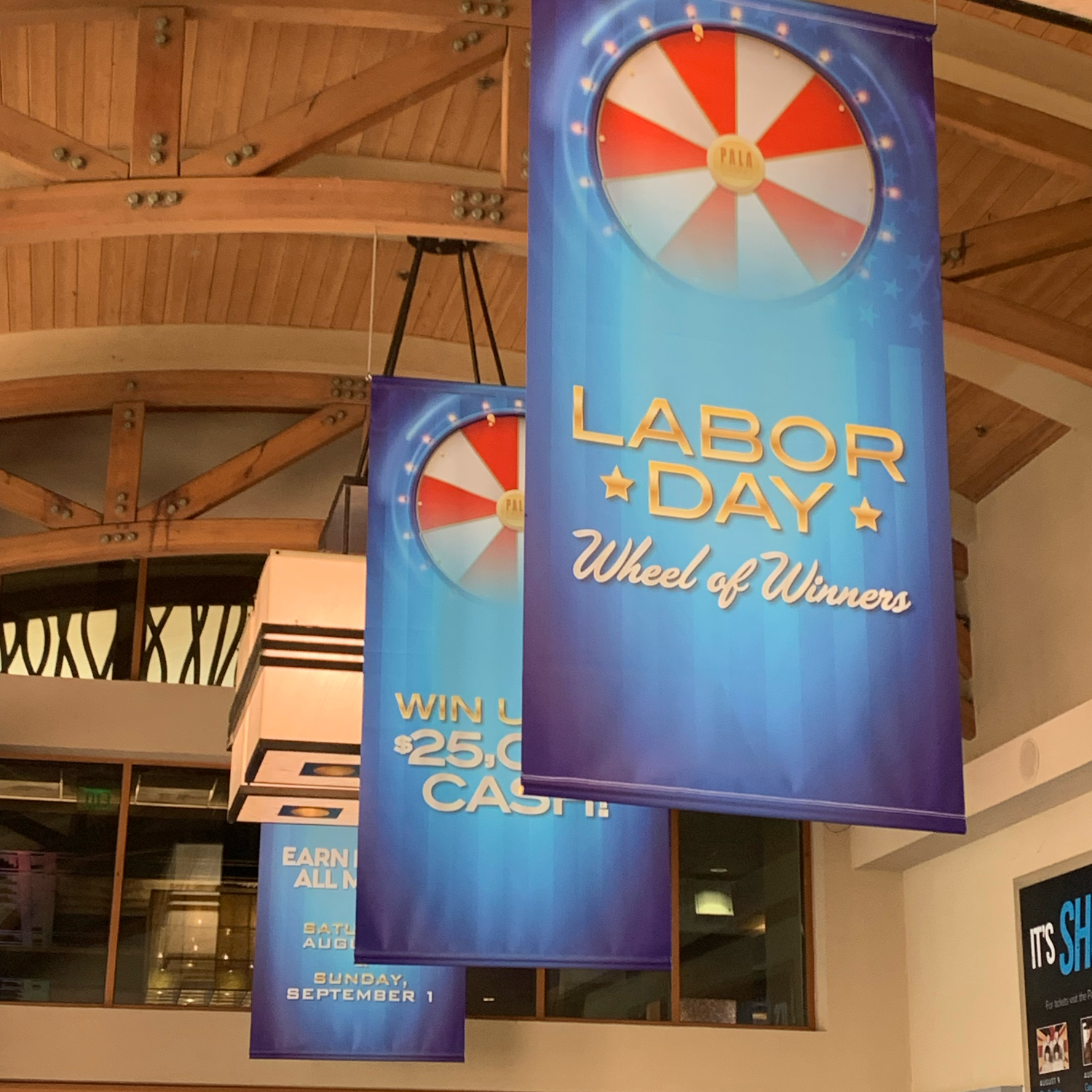
- ✅ Keep text big and bold. Rule of thumb: 1 inch of letter height per 10 feet of viewing distance.
- ✅ Contrast matters. Use high-contrast color combos like black-on-yellow or white-on-red.
- ✅ Less is more. Focus on one core message, one call to action.
- ✅ Make it scannable. Use bullet points and short phrases. Avoid paragraph text.
- ✅ Use high-res images. Grainy photos don’t scale well — we recommend 150dpi minimum at full size.
Ready to upload? Before you hit send, review our Banner File Setup Guide to make sure your design is print-ready.
“Chris helped fine-tune our banner layout in 5 minutes flat. Way easier than trying to DIY it. The print looked amazing.”
– Yelp Review
– Yelp Review
Design smarter. Print better.
Still not sure how it’ll look printed? Just send us what you’ve got — we’ll take a look and offer any layout or sizing feedback you might need. Fast, honest, no fluff.
📧 sales@760print.com
📞 (760) 758-1140
Proud To Print For A Variety Of Businesses


